Behind the Scenes: Improving Website Search Bar Issues and Accessibility.
- Jenna Pal

- Nov 29, 2025
- 2 min read
Updated: Dec 26, 2025
I swear this website will be the death of me! Aghhhh!
After the checkout address issues I experienced a couple of days ago, I wasn't ready for another issue to arise. It seems to be a never-ending headache trying to fix one thing after another and then a new issue presents itself! It is exhausting!
This time it is a website search bar related issue.
The previous search bar was deemed to be non-accessibility friendly (for those who have disabilities) so I was trying to do the right thing by solving it (thinking this would be a simple fix) but it wasn't, as I had to remove the previous application that created the bar and install the new version, however, the problem now is that; whenever you type anything into the search field, it is doubling up categories in capital and lowercase letters and the wrong products are showing up in the wrong categories. It is so frustrating but as it is outside my control, I just have to focus on finding another solution as a temporary fix.
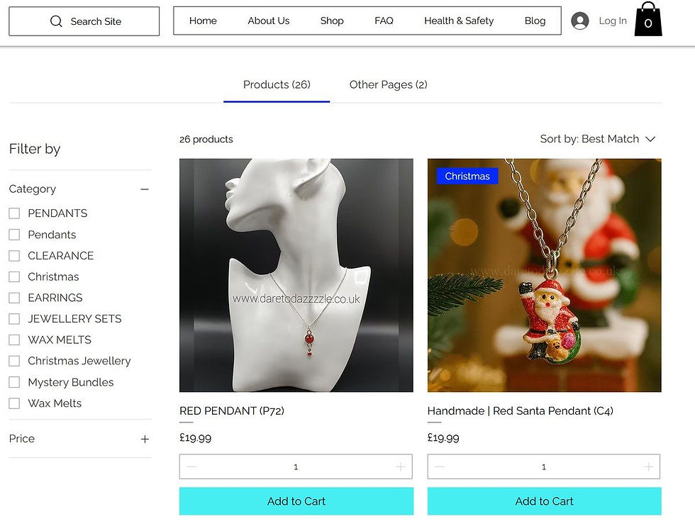
My website provider are trying their best to resolve it, but in the meantime it is advisable that when you enter text in the 'search site' field, that you ignore the menu and just focus on the product images that pop up, then use the 'sort by' filtering option on the top right to sort the results according to your needs. This option currently puts the most accurate result at the top of the page.
Despite everything though, some amazing things have come out of this experience.
I ended up changing our main menu which is one of the most prominent features on our website (as the old menu didn't fit in well with the new search bar in terms of style, positioning etc.) If you want to see the new version, it is at the top part of the picture above. (This menu change only applies to the desktop version.) I think it looks pretty sleek and has a cleaner interface than it had before! I also went through the rest of the website and optimised web pages to load correctly on mobile phone screens (as I didn't realise some screen text was cutting off on some pages). My brand colours have also been made more consistent across the website so I guess there is always a silver lining.
If any of you experience any further issues, please do not hesitate to contact me and I can look into this for you.
I am sorry for any inconvenience caused.
Please note: only people who sign up to our mobile app can post on this blog.
Thank you for your love and support.
Jenna Pal.
Founder Of Dare To Dazzzzle.


Comments